Depending what you’re looking for, both ways can be useful, I’ll scroll through the timeline if I’m trying to find something in between events (and the icons on the timeline help keep track of where you are).
If you tap the video while watching SD card video, there is a forward and back arrow. Tapping those skips between events, which is handy if you’re trying to find one in particular without going back and forth to the events tab. This works in both “continuous” and “events only” recording mode, not sure which one you’re using.
Also note that you can “pinch” and “stretch” on the timeline to zoom in and out which is very handy too and took me like a year to figure out (only after someone else here mentioned it).
They actually just made some changes recently, going from vertical to horizontal timeline (which I believe is what the v3 had). I would prefer if the timeline was overlaid on the video like it used to be but they seem to be playing around trying to find the best mix for people.
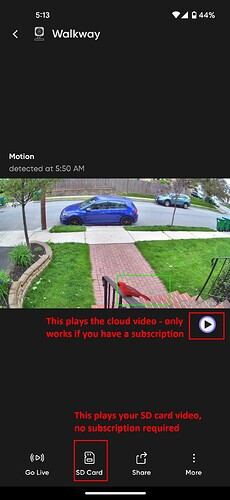
The biggest problem is that on the event screen after tapping a notification or event, there is a “play” button that leads you to an advertisement for Cam Plus if you aren’t a subscriber. The reason being that “play” button is to play the cloud video, which us non-subscribers don’t have. But they do not make that clear, obviously your instinct is to hit the play button and then people thing they got ripped off because they can’t view the video on the SD card. They should have a label or maybe have that pop up screen clarify it.
I’d say the only thing I don’t like about the newest interface (with the horizontal timeline) is when in landscape mode, double tapping now shrinks the video to bring up the timeline on the right, where I was used to that being zoom in/out. But before, you could not bring up the timeline in landscape mode at all. So I guess it is good and bad. Like I said, overlaying the timeline on the video like older interfaces I think is the perfect setup, but doesn’t seem like the way things are going. Maybe people didn’t like that it blocked parts of the video.
I made this a while back, I think you’ve already figured it out but just in case it helps clarify. I think after a day or two of using it you’ll be familiar with the new interface, personally I find it easy to use but I know people coming from the older cams don’t like it at first (we all prefer the familiar obviously).
Wyze should probably invest the time in a good quick reference/UI overview guide, would eliminate a lot of negative user experiences, both for new users and ones coming from older cams.