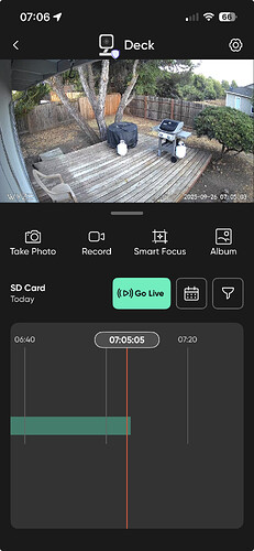
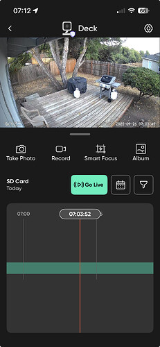
I have four outdoor cameras and I am very disappointed with the fact that you changed the long green Live Playback Button with the 30 second increment scroll back to the crap you have now. It is so much more difficult to view live playback throughout the day. Trying to get my finger to the exact time I’m looking for is ridiculous. I’m letting you know right now, if you change my indoor ones to this crap I’m cancelling all my subscriptions and going elsewhere. I WANT MY BUTTON BACK!
In addition to spread/pinch gestures to zoom in and out, does that new microSD playback timeline for Cam v3 support double-tap to zoom (both in and out)? I know newer Cams that have had this updated UI for a while have that feature, but I don’t have any Cam v3s to test.
Yes double tap will zoom in and out on the V3 playback timeline.
Thanks! I didn’t want to assume.
I agree that the new format is terrible. While the timeline is there like you show, when I rotate my phone to watch the video in fullscreen, the timeline bar is gone. The only option in full screen is the 30-second button. Another thing, I use to be able to backtrack and go forward while zoomed in, but now it reverts to full screen every time I hit the 30 second button. So annoying!
It’s hidden when in landscape mode. double tap on the live view to show the timeline.
Wyze likes to hide controls in this manner. There should be visual cues that there are hidden controls.
With my iPhone in landscape view playback looks like this after double tap. Previously it would show the timeline on the bottom.
Another choice of a bad UI design. Don’t get all the wasted vertical space in the timeline section. Wyze needs to hire a real UI/UX designers.
This topic was automatically closed 90 days after the last reply. New replies are no longer allowed.


