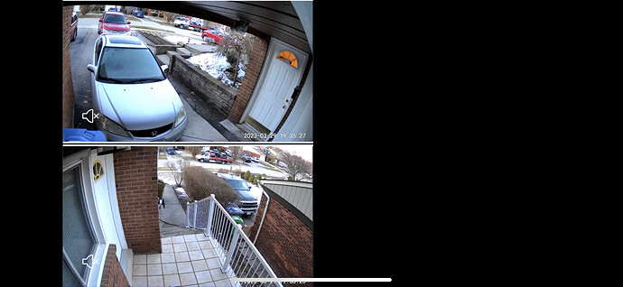
New problem: When viewing grouped cameras simultaneously (in landscape mode/rotating device), the 4-camera (2x2) GRID view is askew and disproportioned. Anyone else?
Yeah, they changed it way back when. Not a big fan myself, I cried and cried, but no one listened. Head over to this thread and voice your opinion.
Strange - I have an iPhone 12 on iOS 16.4 and it looks correct on my device.
Because the aspect ratio is different on that device. Wyze needs to change the programming from static to dynamic to accommodate different screens
Can we see a screen capture of what you’re seeing? Looks fine for me on both android and iOS.
This is a known issue on the latest IOS app Wyze is looking into.
Example (landscape mode, requires horizontal scrolling, but black side bars don’t go away.)
I have been asking them the same, and very vocally I might add. As I’ve said before, they made a change for the sake of change, which is never good. A change should reflect an improvement. If you can’t improve on something, leave it be. No pint of fixing something that is not broken.
Test flight does not show a newer version for me…
Just upgraded to 2.40.0 (6) and everything is fine.
Yes, well almost, there’s a white key line between the cams. Here, see for yourself. This is iPhone 11
Mine works fine in landscape on both my iPad 6 and iPhone 11 on firmware 2.40.0 (15).


