Wow. Lot’s of variations. thanks! I doubt they’ll ever standardize/make the UI uniform between models.
Noodling around with the OG SD vert some more, I can see you gain some you lose some. Though the spinning hourglass (equiv) when scrubbing is a BIG ‘lose some’ that blots out the sun of all the pretty ‘gain sums!’
I liked the horizontal scrolling before. But didn’t like that I had no indicators of where the movements/animals were.
I like the vertical scrolling now, not only because of the indicators, but I can see more of the timeline than with the horizontal viewing.
I think I only have one v3 left that has the horizontal viewing.
That’s a recent thing with the 3.x app, at least for me on Android. They used to be my fastest responding cams (actually still are for loading live view, but not for SD card anymore). On my old phone with 2.x they’re still snappy reviewing the SD card.
A lot of people don’t realize you can pinch to zoom in/out on the timeline. I didn’t until I saw it mentioned here. For me the zoom in in the handy feature when trying to get to a specific time.
I found that if I wanted a quicker show time, I needed to click on devices, and choose the camera I want from there. Because being in the favorites makes all the cameras live at the same time and I don’t like that.
Yep, I turned that new “live favorites” feature off as @crease describes, it caused too many issues for me, trying to connect to too many cams at the same time or something. When I do want to see multiple cams at the same time, I have the ones I want in a group at the top of my favorites, tapping that has basically the same effect, for whatever reason doesn’t seem to cause the issues that the favorites screen does, and you can your phone sideways and see 4 of them on the screen nicely. But more often than not I just tap the 1 cam I want to see from favorites (not the play button that will now be there after disabling that feature, but around it so I go to the cam’s actual interface).
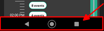
On mine when in portrait mode the timeline takes up over half the screen so plenty of room for zooming. Maybe you have your phone set to enlarge stuff? That seems to cause issues with a few things in the wyze app like displaying QR codes etc.
Oh yea, I used to have them all in groups before. I may try doing it again and see how it goes. I just liked seeing them all on one page, but not all live at the same time. I believe before, only one was live while you could still see all the other cams. Oh well. I don’t go in there as much these days, so it’s now a big deal to me now.
With the 3.x app you can have cams show on the main screen and also be in groups (which was not the case with the 2.x app). If you disable the “automatic” live feed on the favorites tab in the app settings, it puts a play button on each camera so you can still have it for one or two if you like, you just have to tap them to get them to play each time.
For me, it’s fewer things to remember/learn (gestures), especially when I want to try to have a uniform experience across multiple devices, so that seems more efficient to me. (I go nuts when my sister hands me her phone, which she’s selected to use gestures, and I moved away from Samsung years ago because they put the “back” button on the wrong side of the strip.)
I wonder if the difference between your experience and @dave27’s is a consequence of phone/screen geometry. I can pull up the same Wyze Cam v4’s Live Stream screen on two different devices, and one of them will show four controls in the menu bar below the view pane while the other will show part of a fifth control, and that fifth is the Siren control that so many people complain about accidentally activating.
I guess it is pretty similar, mine takes up about half the screen when I’ve hidden the menu like you have. Probably just differences in our phones. In my case I find it large enough to work with, though the horizontal one in portrait mode is obviously much bigger.