Just unboxed and did my first measurements. No explanation of what I’m seeing on the screen. Just spent a half hour on Google trying to find what the green bar, hollow bar really mean and when it goes from hollow bar to green bar back to hollow bar. Zero explanation of the ranges. And can’t be found. I want to know exactly how to interpret the green bars. Sigh.
What device are you talking about?
I’m guessing it’s one of the Scale models, but much more detail would definitely be helpful here.
Welcome to the Forum, @laverne126! ![]()
Please let us know more about what you’re trying to describe. That helps us in attempting to help you.
Sorry if I was unclear. I meant the Wyze Scale X.
I mean, I get what the bars represent, but a bit more explanation would be helpful. In fact, any would. I don’t know why it’s green then hollow then green then hollow. Unclear.
But I appreciate you responding.
This is a helpful detail. Thank you for adding that. A Moderator has changed your topic’s category and tag to reflect this and help improve your topic’s visibility.
I believe these are just used as visual indicators to demarcate ranges along the spectrum. I’m using Scale S, but I imagine the UI for Scale X is the same or very similar.
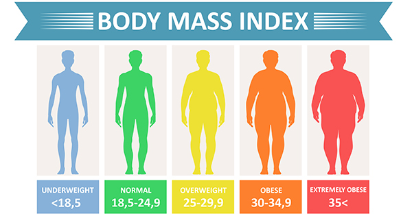
In the case of the BMI calculation, for instance, when I tap into that to get more information, I see a solid green bar over the “Underweight” range, which changes to an outlined bar over the “Normal” range, which changes back to a solid green bar for the “Overweight” range, etc. The app is just using the solid-versus-outline difference as a way to delineate segments (categories) across the range of BMI that it’s displaying.
I imagine the app designers made the choice similar to what cartographers do with map scale markers. It’s another option for visually displaying a linear scale, like this:
It definitely could be more helpful, for instance choosing colors and color contrast to use as an actual visual indicator would improve the user experience, I think, and it’s something I’ve requested in the topic suggesting changes to the new app. Using BMI as an example again, it might be helpful if the “Normal” range was solid green while other colors were applied to the remaining ranges.
Since you’re new to the Wyze Scales, this might save you some future frustration:
It also illustrates another questionable design choice from Wyze.
As far as providing more information about each of the scale’s metrics is concerned, I would speculate that the Wyze designers were taking at least a couple of things into account:
- They have limited screen space within the app to describe each metric.
- They’re not trying to be a medical device supplier. With a product like Wyze Watch, they’ve been explicit that this is not a medical device.
I think the Scales can provide a way for you to gather some data about yourself, and then as an informed consumer you can do your own research about what the metrics mean and consult a health care professional if you have additional questions.
Fair assessment.
Understood.
Thank you so much for your help.
Yep. Maybe in a new release, some tweaks to the UI.
Very helpful.
Have a good day.
Thanks. I like to think I’m generally fair in my assessments.
You’re welcome. I’m glad that you found it helpful.
Likewise!
Incidentally, I thought of another case where someone has used contrasting segments on a linear scale to mark regions of measurement: Adam Savage (of MythBusters) has a ruler tattoo on his forearm that does this very thing…if that’s your thing. ![]()