Hi,
Even for 14d it will be beneficial. Let me try to better describe.
Question: Let’s say I want to check where I have recordings, or I want to delete all last weeks recordings or just certain days events.
Response: I would have to click and scroll the 14 days calendar on every single day, then interact with the below list.
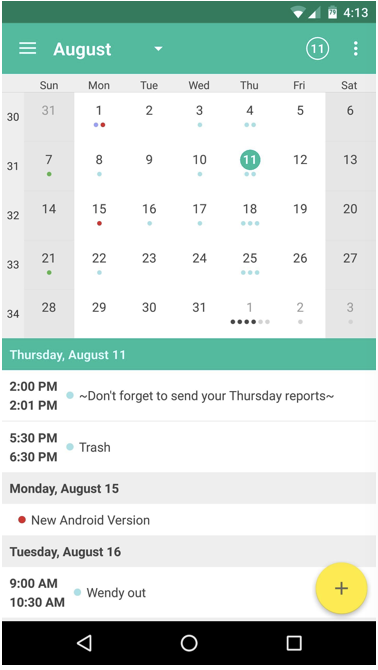
Solution 1: If I had a little underline (under the calendar day text 25) or marker or even a different text color for the days that have events, I wouldn’t have to click every individual day, and realize that out of 14 days only 2 days have events.
Solution 2: If I had all my events in the list below the 14d calendar in order of latest to earliest with line separates of date info (date header) of the related event, the search of the event would be much easier, also while scrolling the list and the date headers reaches the top, the calendar top circle selector moves to the correct date.
Solution 2 would allow faster management of the events, ie. if I want to share my last week of events I would only have to select the event in the vertical scrollable list (making sure they are underneath the correct dates by looking at the date headers they are under) and share them all at once. Same thing if I want to delete them and so on.
ie. Assuming I don’t have recording prior of the 23rd, my last 7 days of the calendar looks like below and this tells me that 28 is selected and 28, 26 and 23 have events.
23 24 25 26 27 (28)
[Fri Dec 28, 2018 or 2018-12-28 Fri] ← Date Header
Event datestamp (whatever)
…
…
…
[Wed Dec 26, 2018]
…
…
…
[Sun Dec 23, 2018]
…
…
----------------------------END of list space on screen-------------
When I scroll up (assuming the list is long enough), and the date header of the 26 hits the top of the list the calendar looks like:
23 24 25 (26) 27 28
[Wed Dec 26, 2018]
Event datestamp (whatever)
…
…
[Sun Dec 23, 2018]
…
…
…
…
…
…
…
----------------------------END of list space on screen-------------
Whit this example you’ll never be able to have the next date header 12/23 reach the top of the list because it’s not long enough.
Let me know if it makes sense.
Thanks